
DINA Lingerie

/DINA Lingerie
/Overview
DINA Lingerie
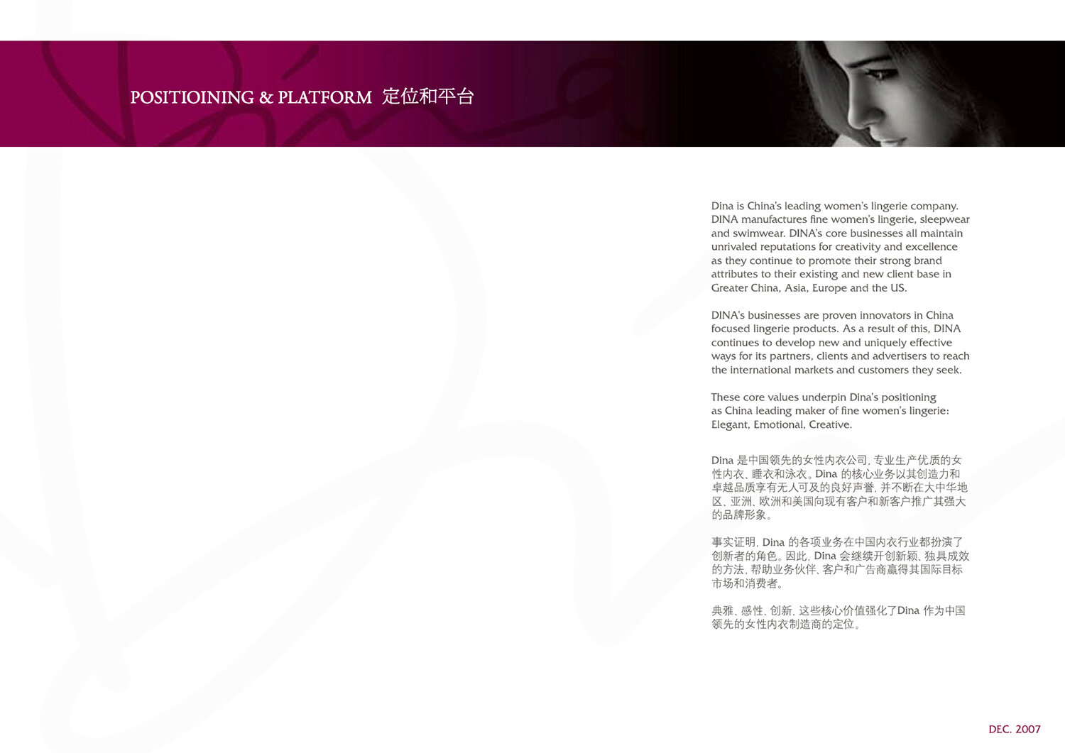
Dina is China’s leading women’s lingerie OEM. DINA manufactures fine women’s lingerie, sleepwear, and swimwear. DINA’s core businesses all maintain unrivaled reputations for creativity and excellence as they continue to promote their strong brand attributes to their existing and new client base in Greater China, Asia, Europe, and the US.
Services Rendered
01/ Production & Service Vision
02/ Key Messaging
03/ Identity & Positioning
04/ Visual Language & Art Direction
05/ Design Production & Execution
06/ Brand Guidelines & Playbooks
07/ Campaign Development
08/ Content Strategy
09/ Art Direction
10/ Video Production
11/ 3D & Motion Graphics
12/ Copywriting
Opportunity
DINA Lingerie retained METERA to help them with a global roadshow to promote the atelier to private equity investors and for a potential IPO in Paris. The creative brief called for the creation of a new visual identity based upon a woman CEO / Creative Director who had served as an inspiration to the management team and employees. The end product was to be an investor vision reel with voice over scripts in French, and Chinese, all packaged in a detailed brand guideline set.
Approach
After the completion of our work on the 2008 Beijing Olympics and XFMedia IPO, we received many RFPs. We were retained by DINA after our first exploratory meeting. With many of the key team members already in place, it was easy to ramp up to tell DINA’s unique investor story for the French, and Chinese markets. We accomplished this by focusing on DINA’s OEMs investor story.
Solution
The team and I created a new visual identity, a new set of brand guidelines, a new website, and an investor vision reel with all of the associated voice-over scripts (in English, French, and Chinese).
OUTCOME
/Results
The DINA listing on the NYSE Euronext exchange (Paris, France) was postponed due to the 2008 financial meltdown but the company was able to raise a private placement infusion of capital because of the work we had done for the OEM.
DINA Investor Reel
The DINA investor reel was shown prior to any discussion of the company’s fundamentals, strategy, and goals.
/Challenges
/Solutions
01/ Proper localization from Chinese into French, and English.
This was to be our second IPO on the NYSE Euronext exchange. French was still a new language for our team to localize into. Because of the specific nature of the investor story, it was important that translations were on point. We went through many interviews with translators before finding the correct company.
02/ Switching from entertainment media and sports industries to an OEM provider.
Making the switch our creative process from working on primarily media related projects to a French IPO listing of an OEM proved to be challenging. Because we had all of our systems in place and were “battle-tested” from two large complex projects, the switch was relatively easy.
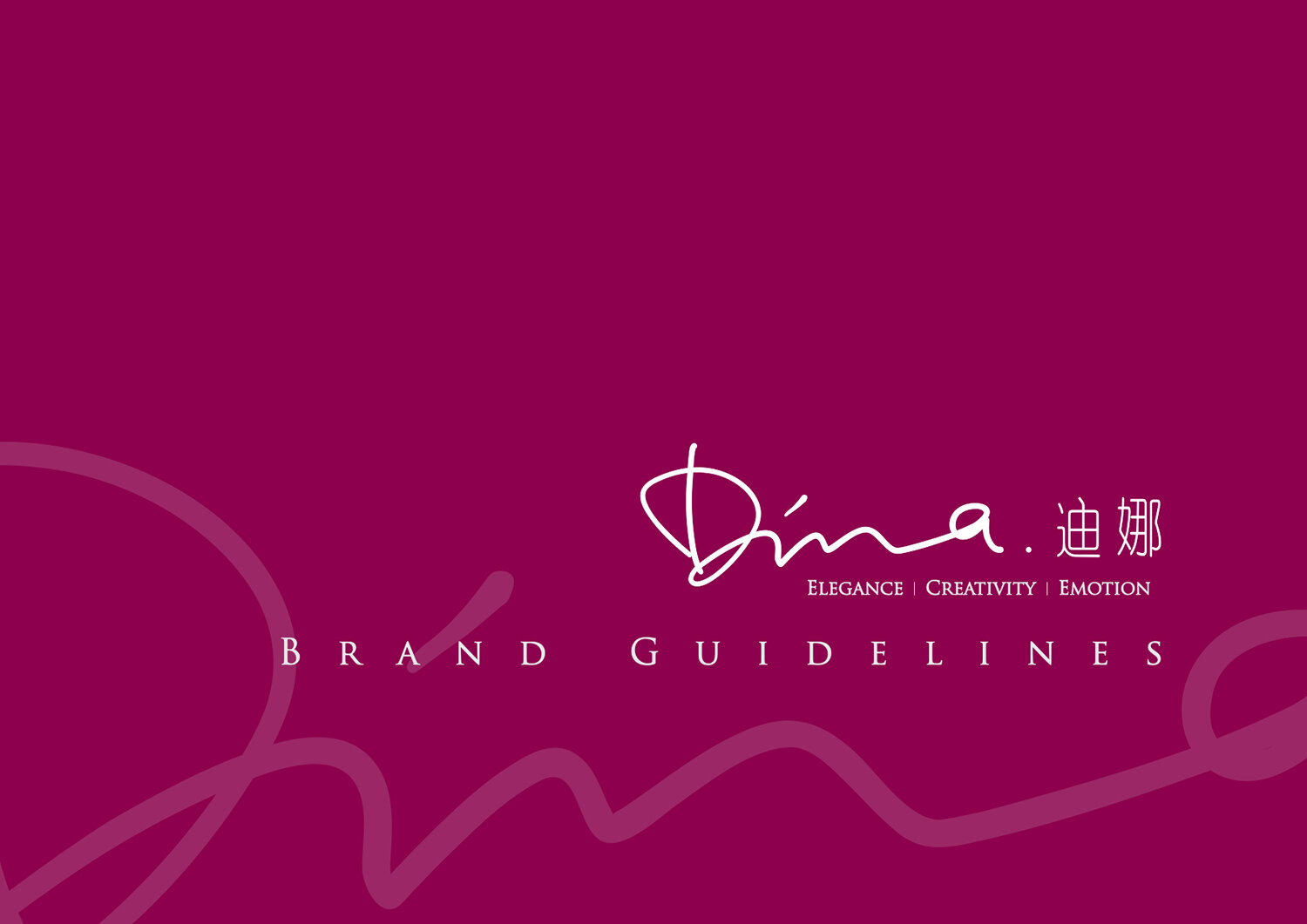
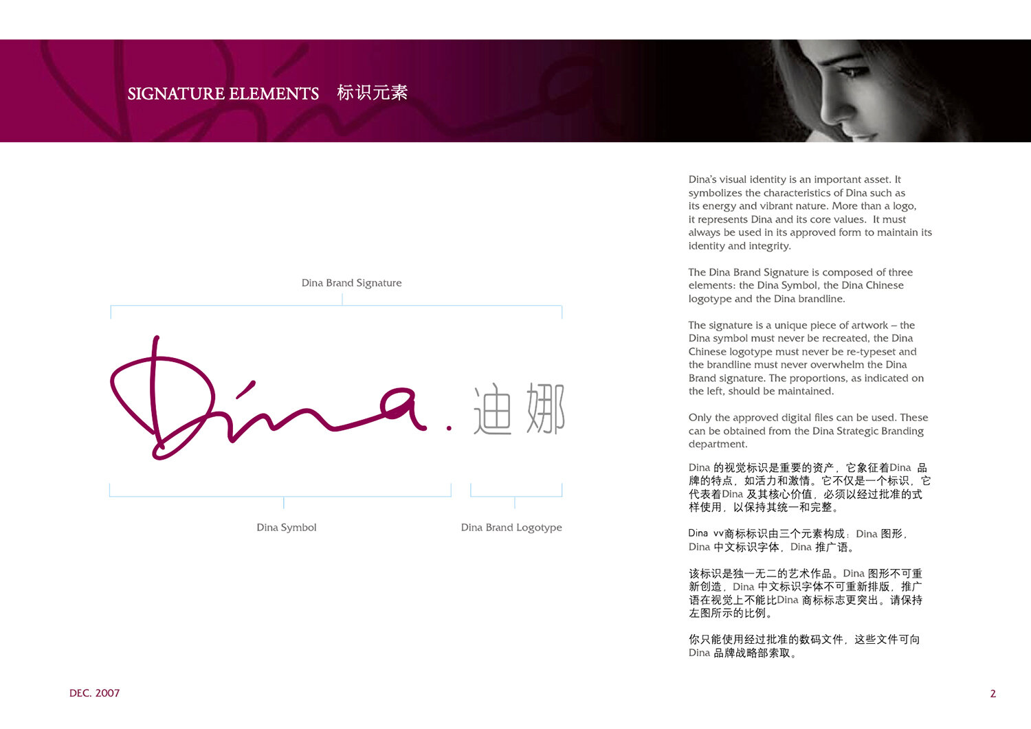
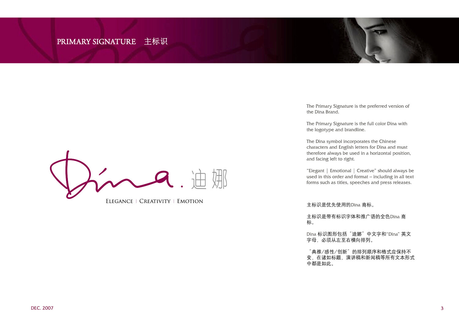
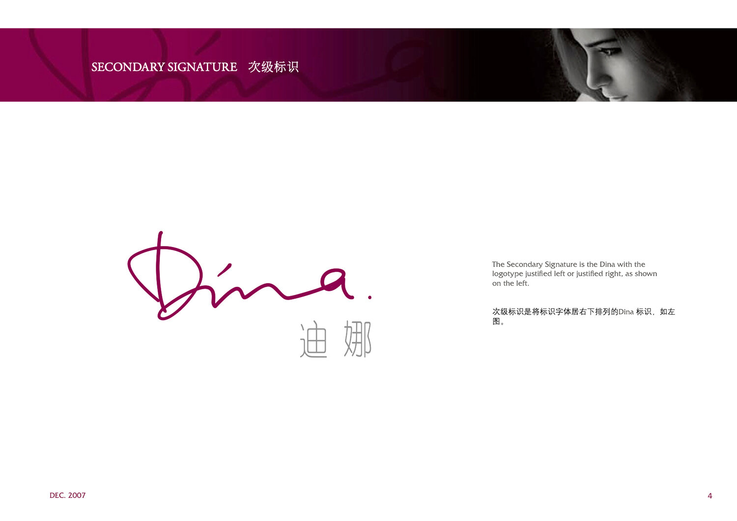
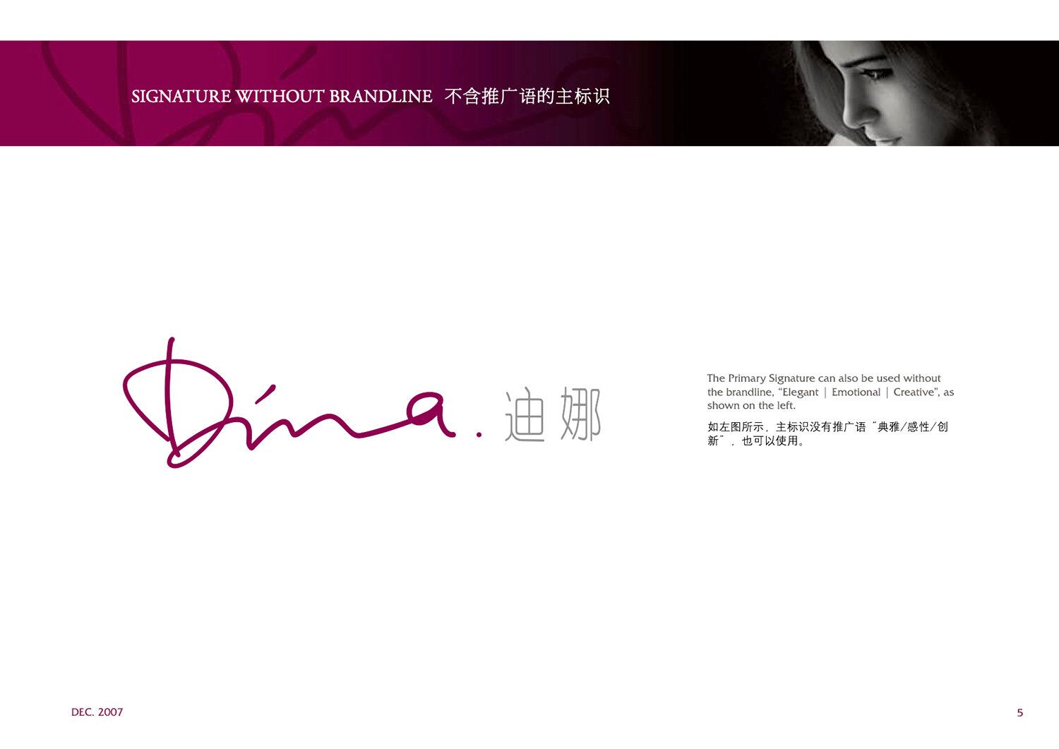
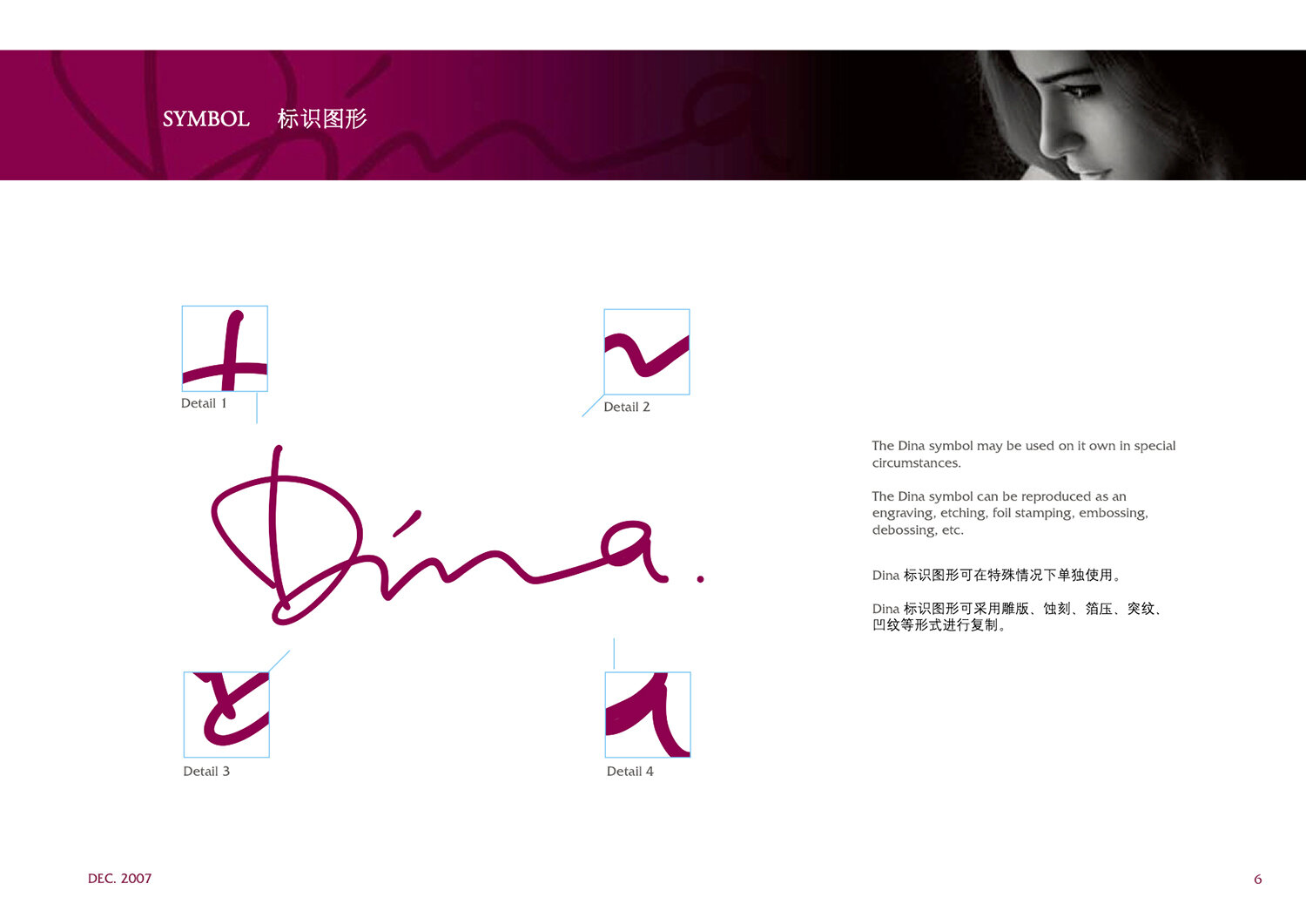
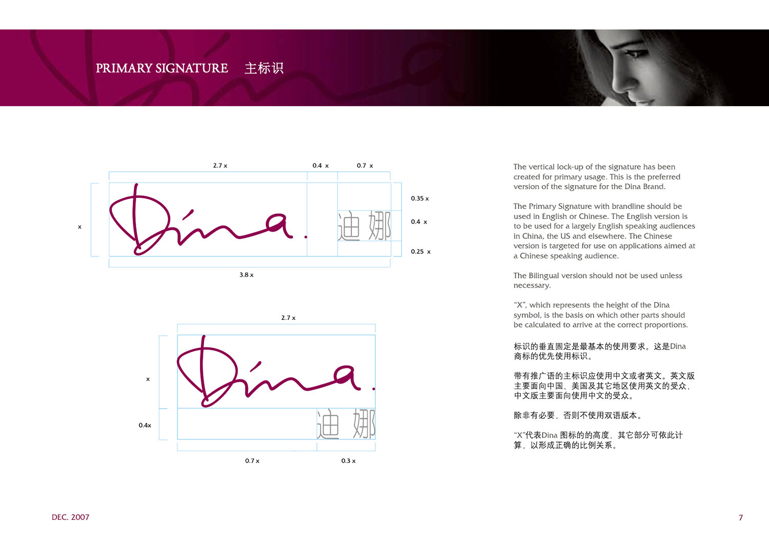
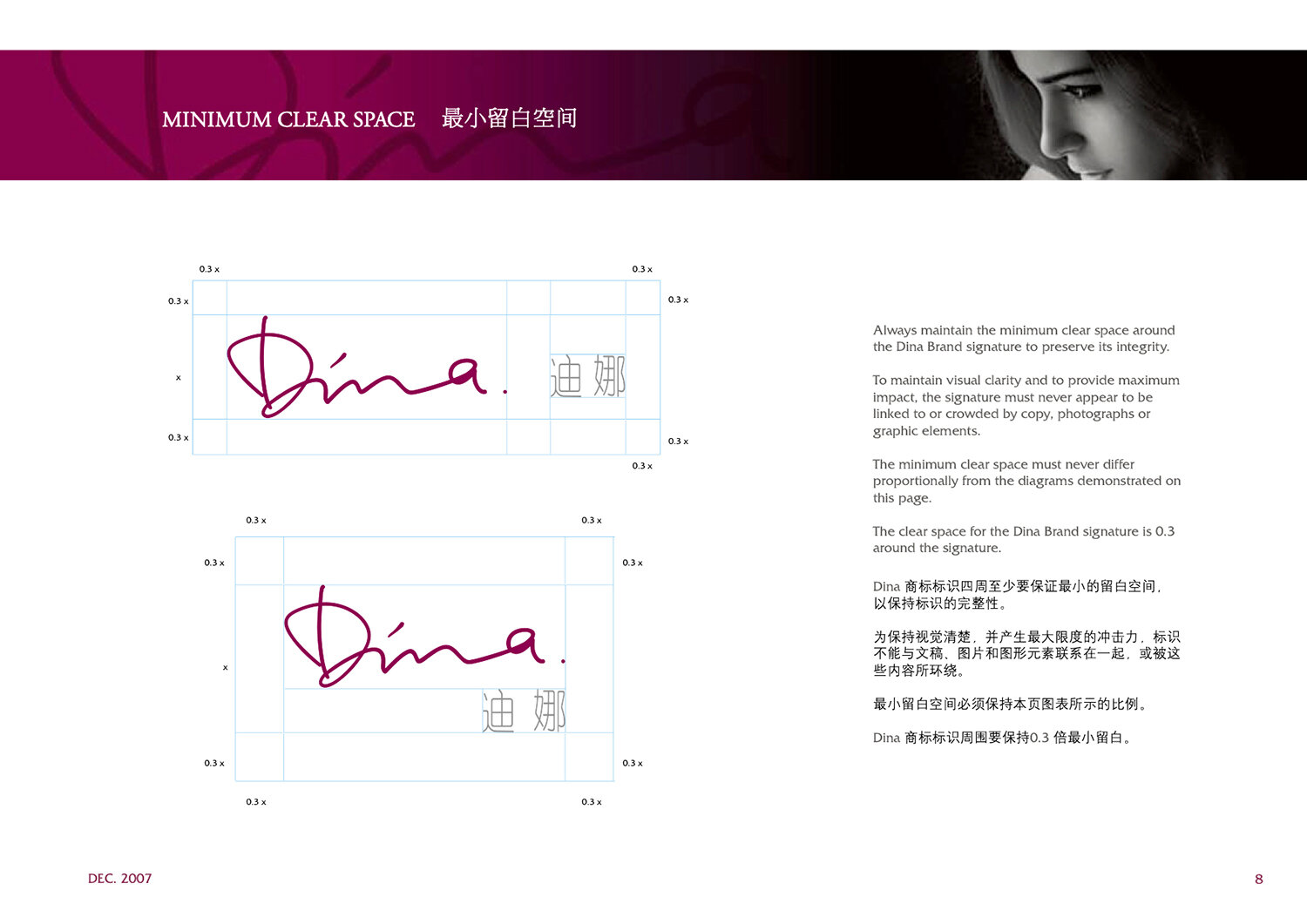
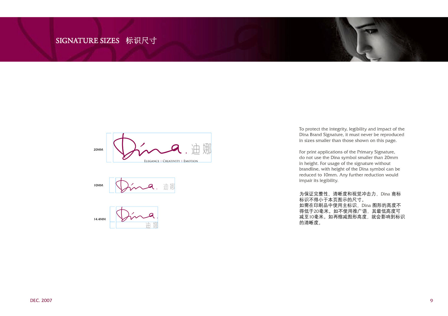
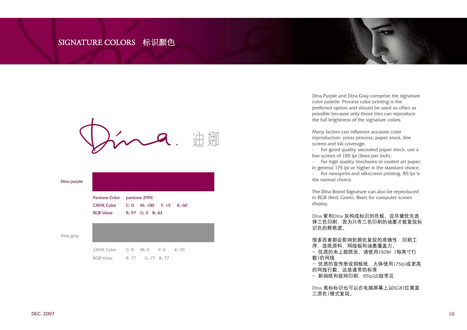
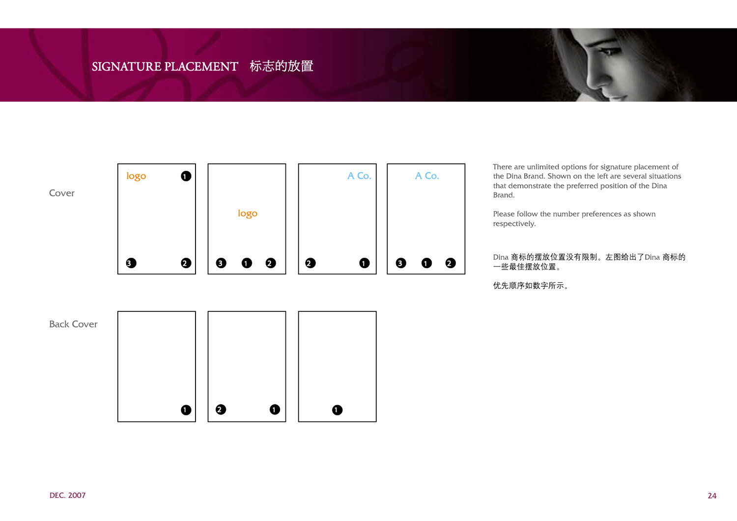
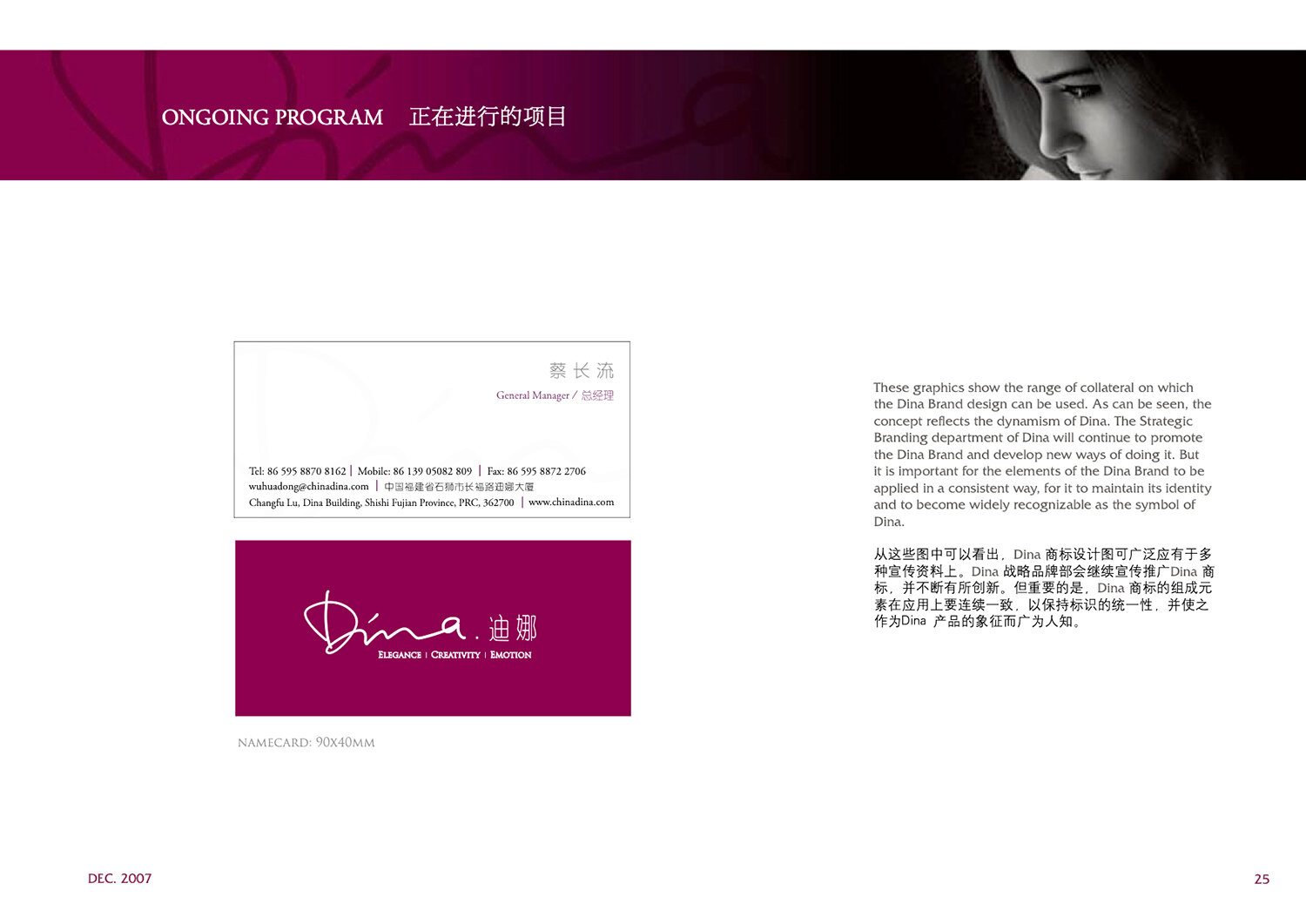
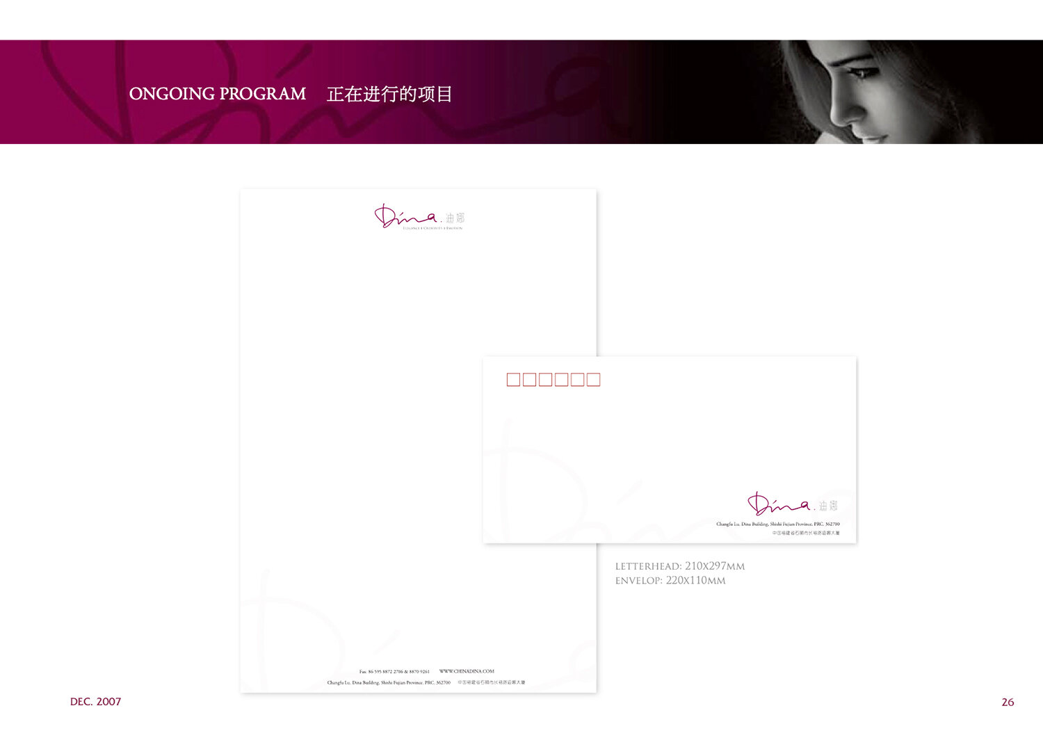
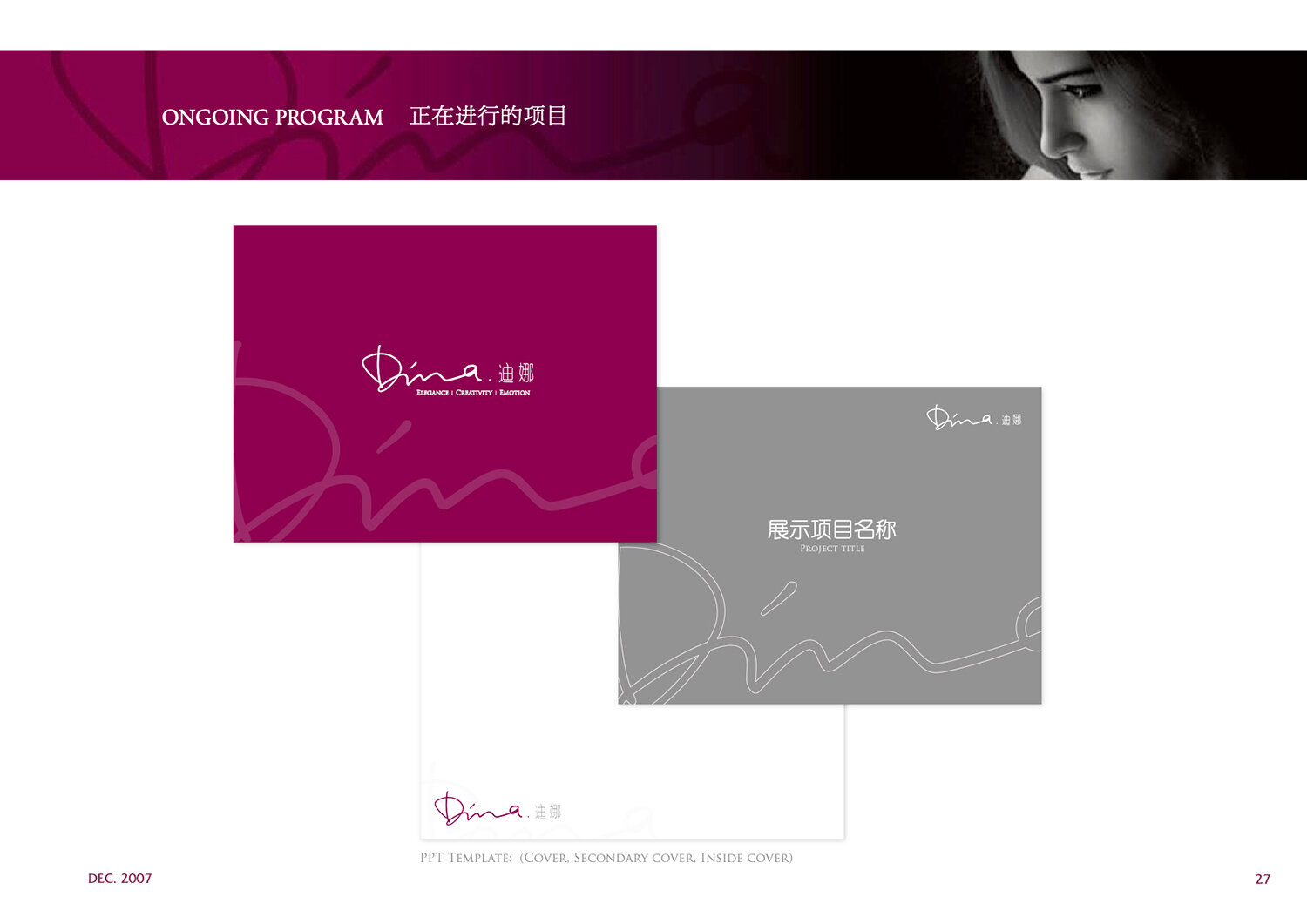
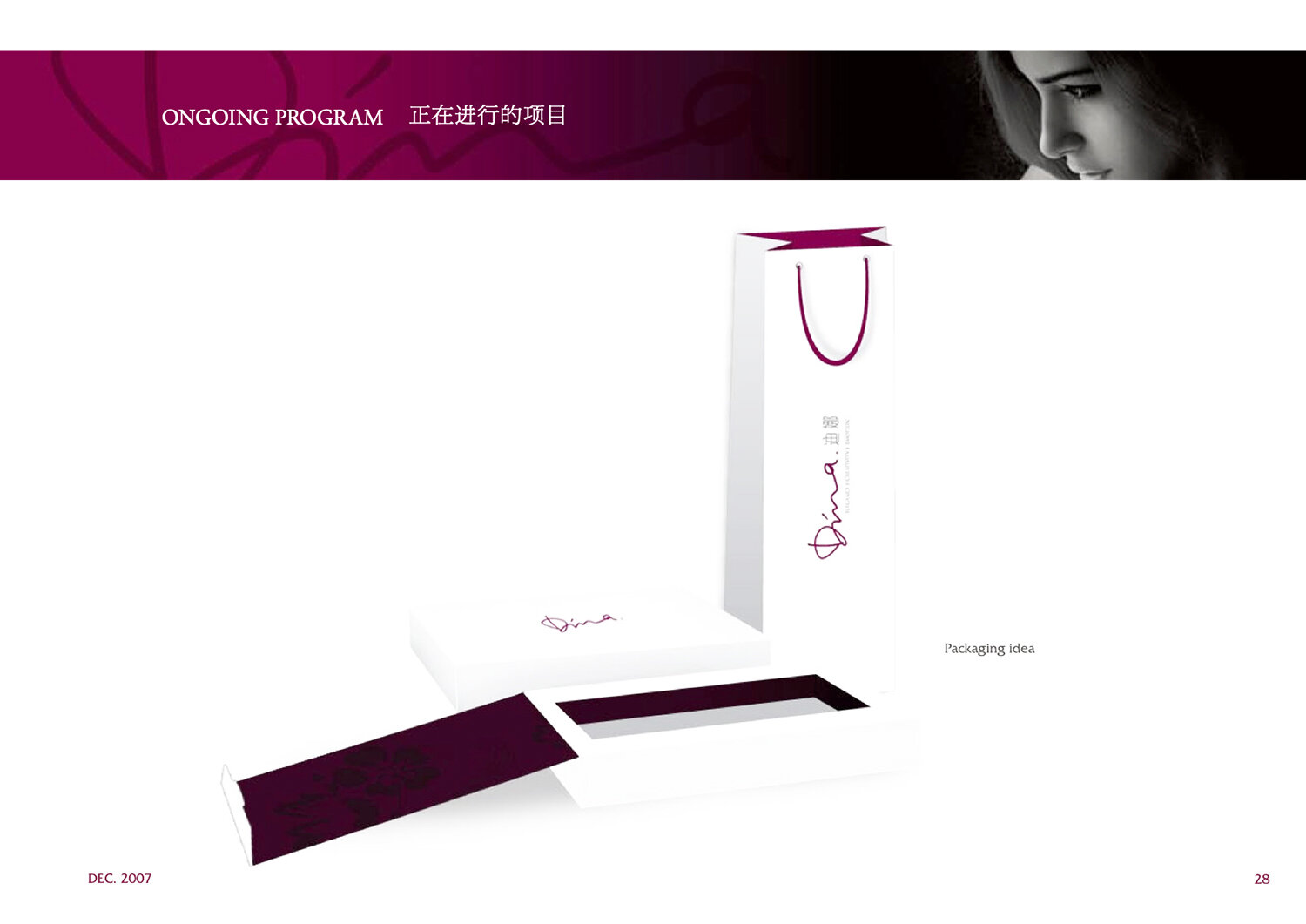
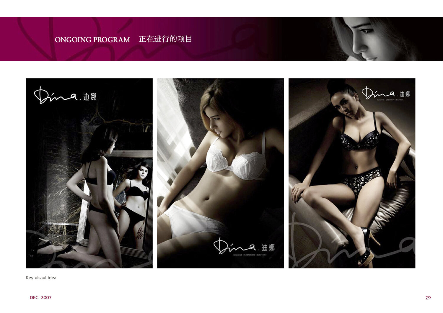
DINA Brand Guidelines
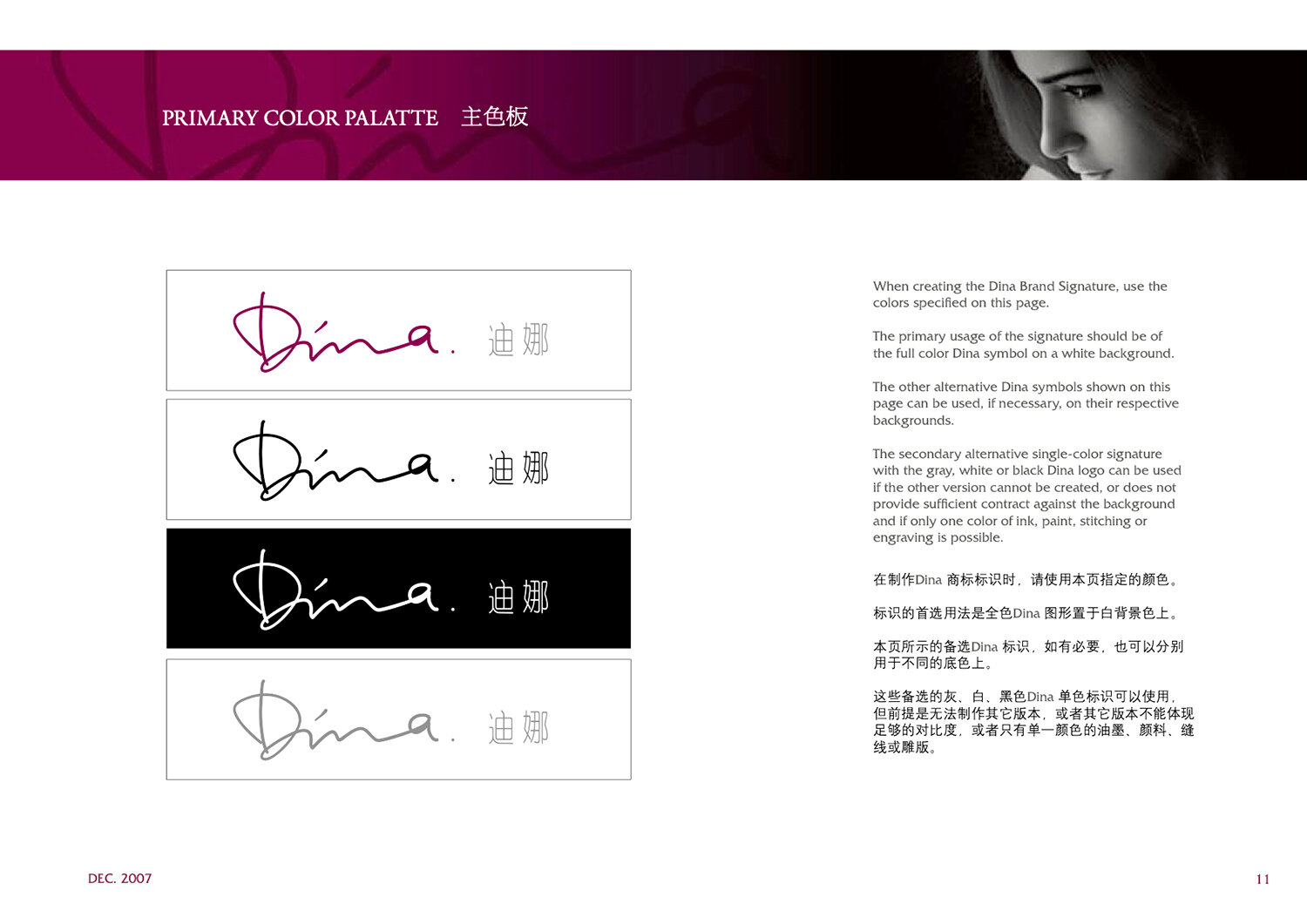
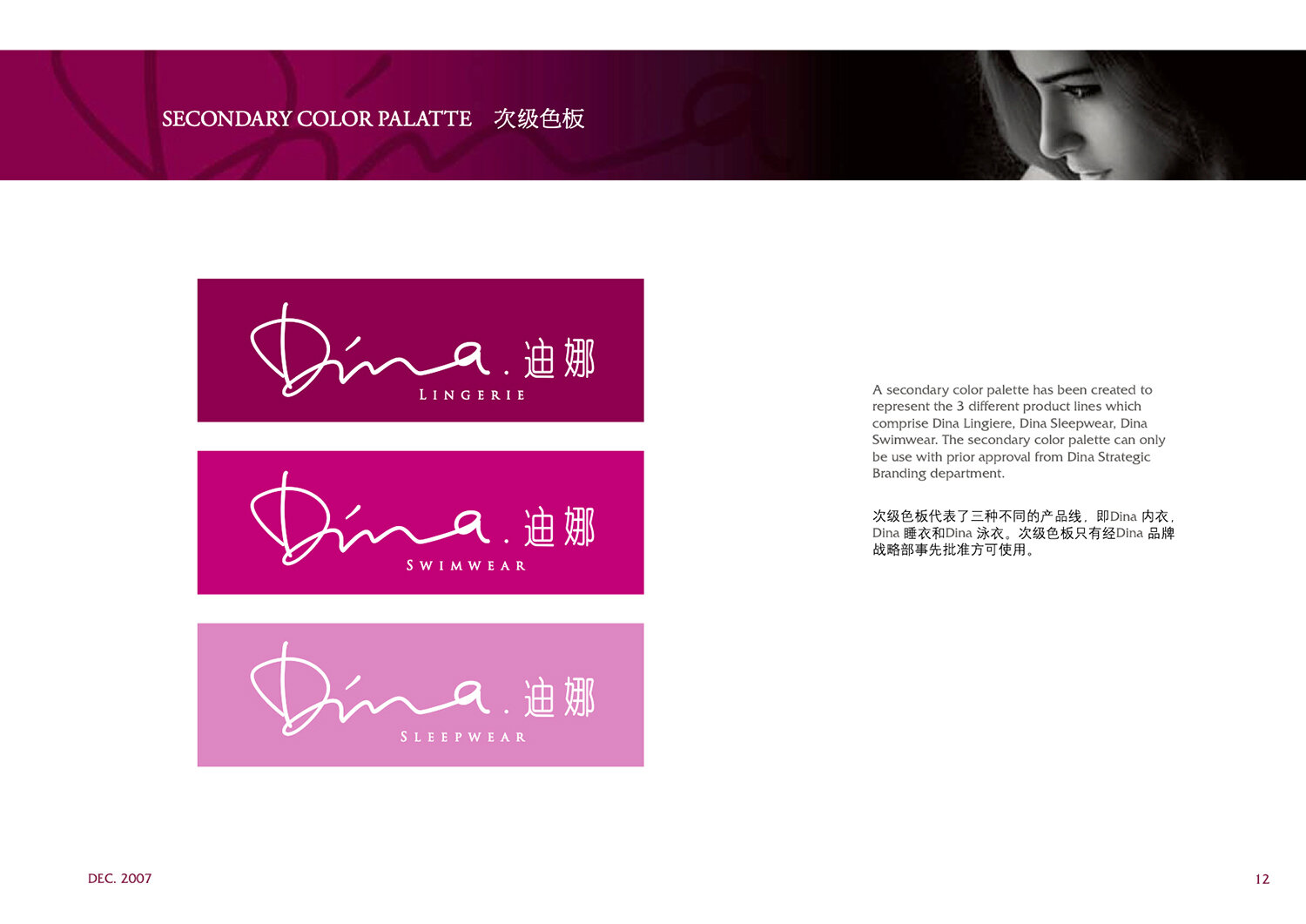
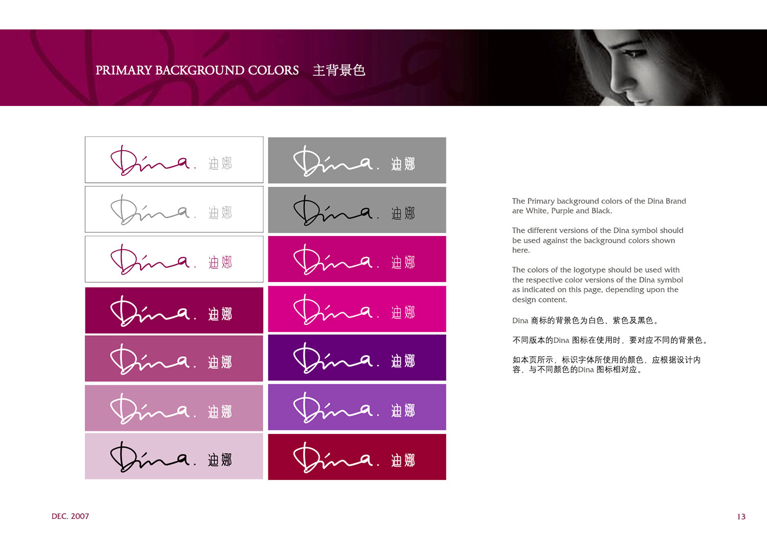
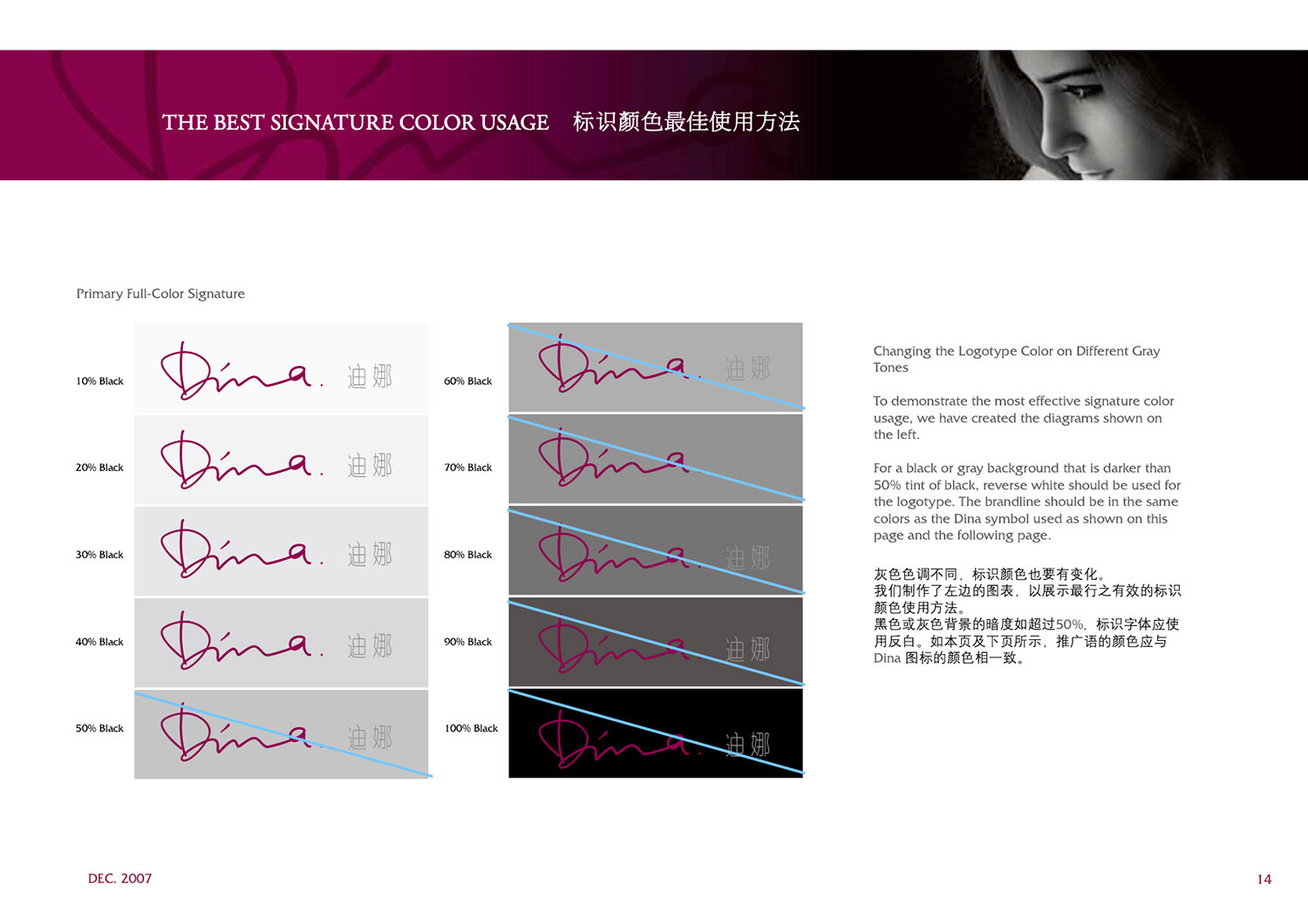
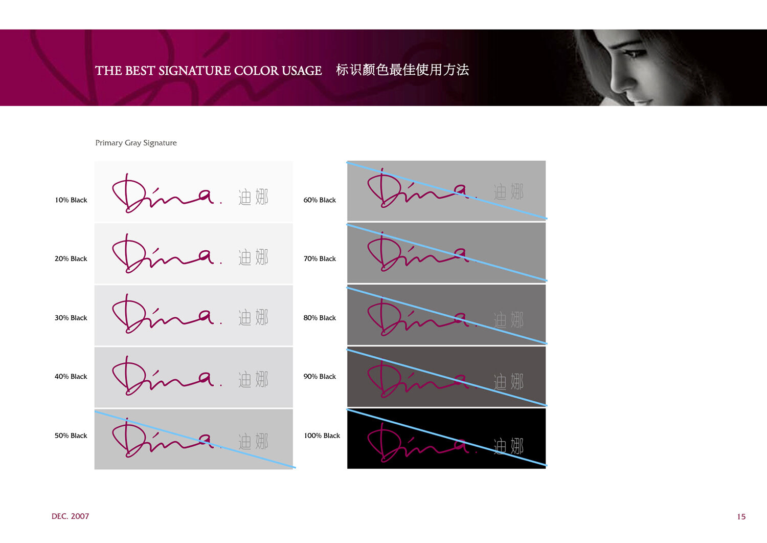
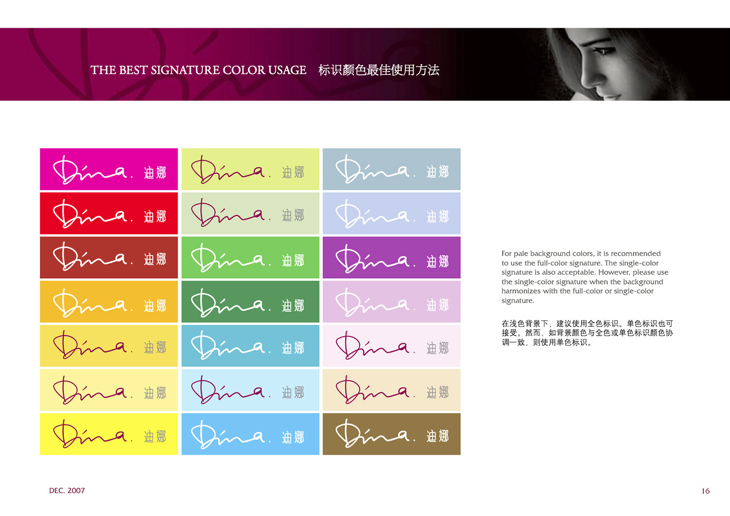
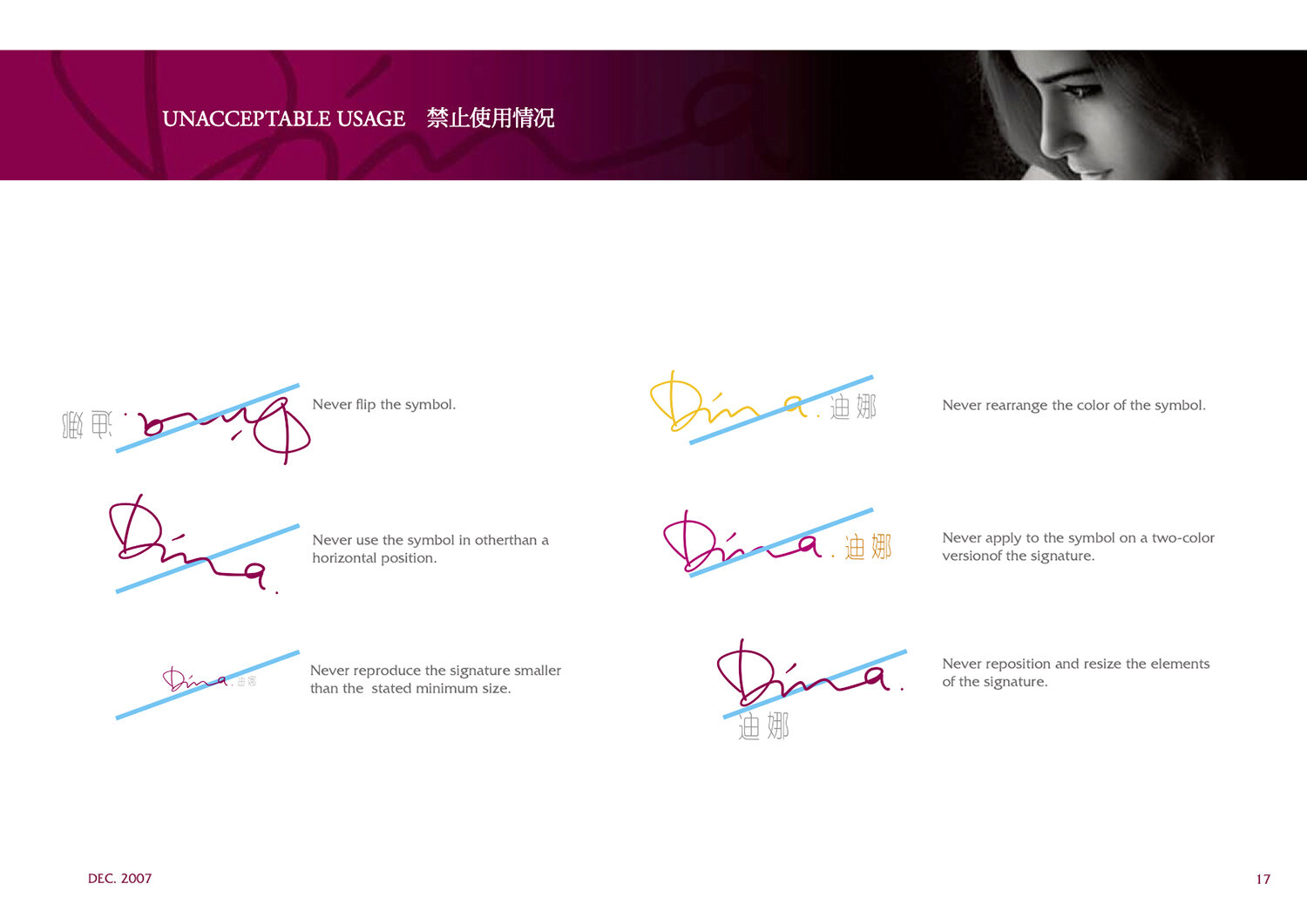
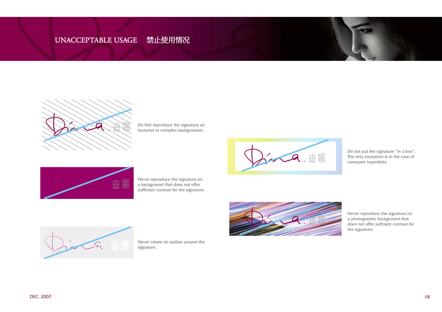
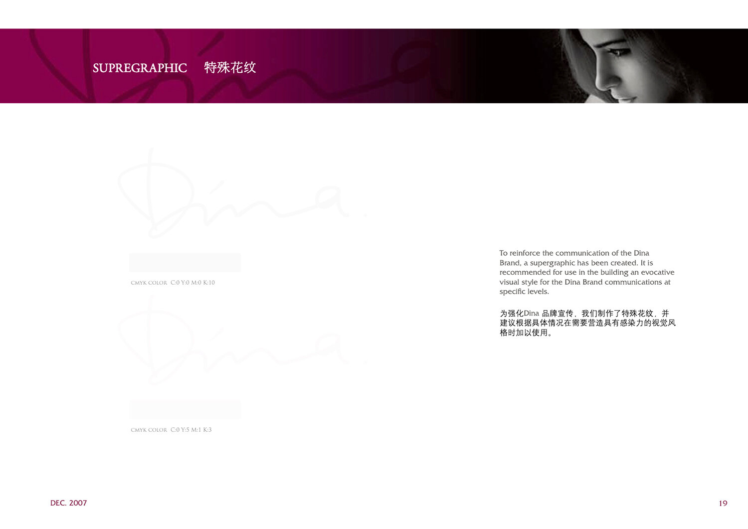
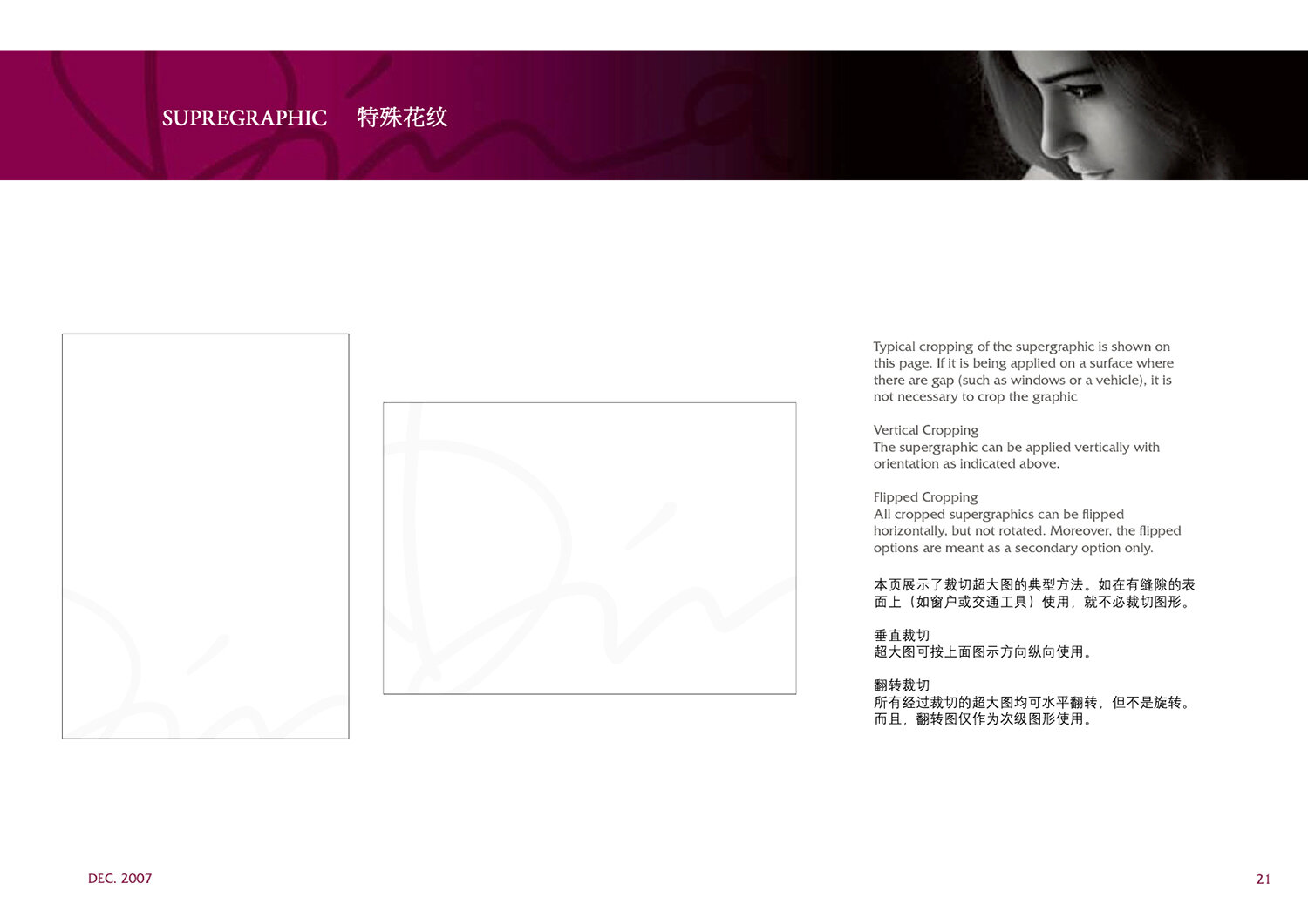
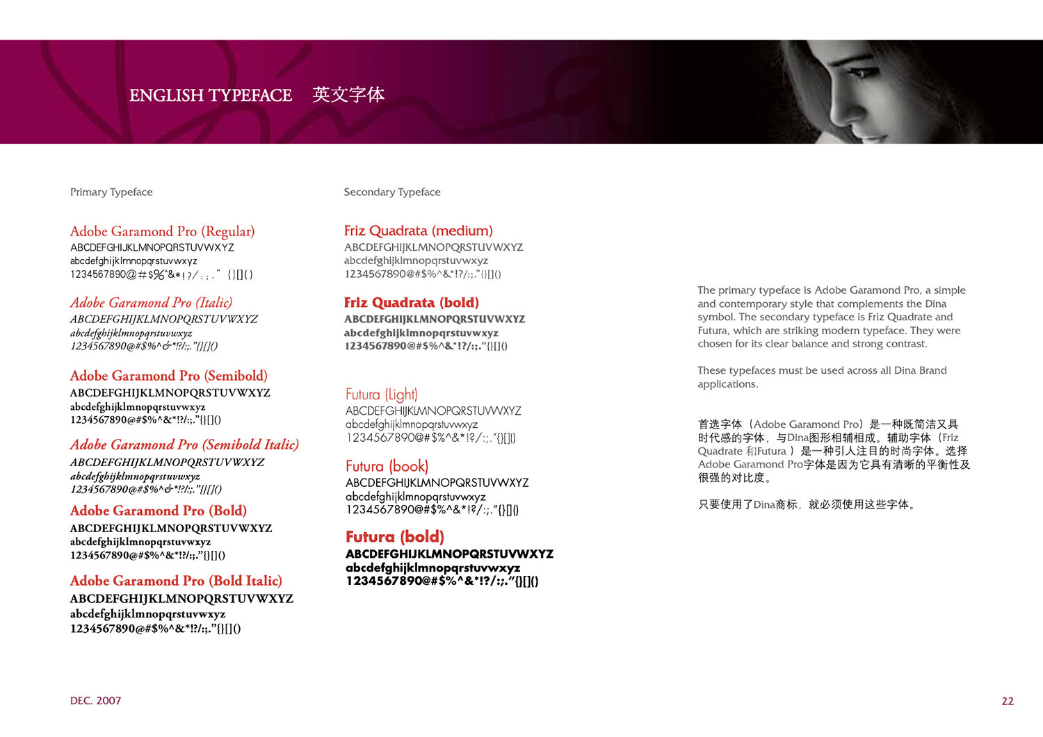
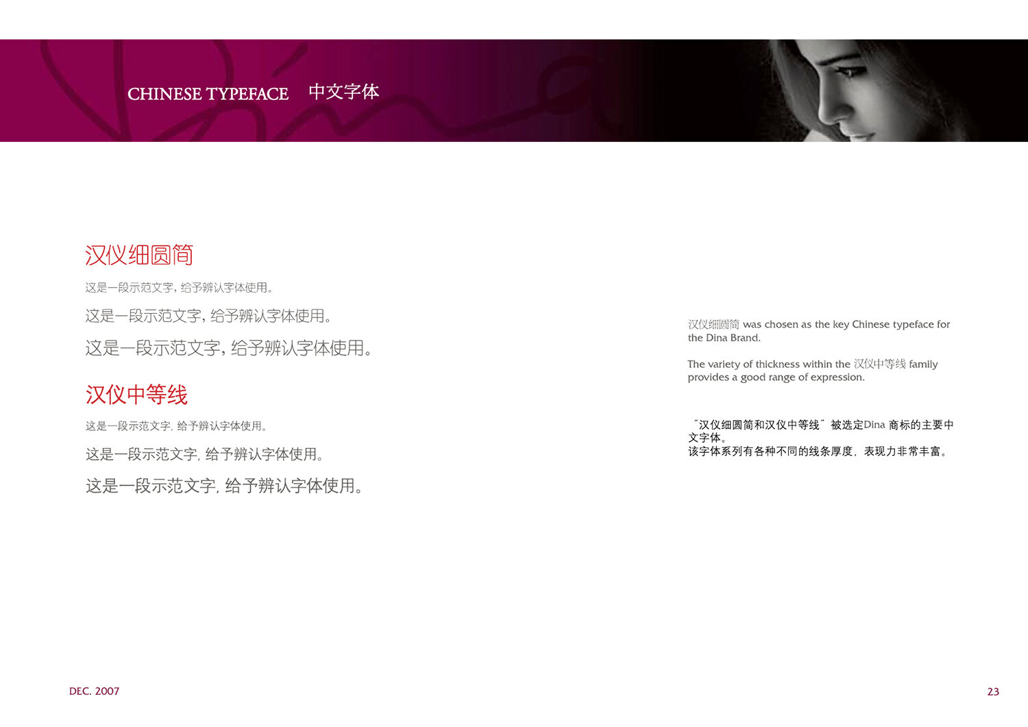
My team and I created a complete set of brand guidelines to be used by the investment house post-IPO. We created the visual identity, logomark, color palettes, key messages, and brand lines.


.WORK /DINA Lingerie